Numbers aside, the dots on the iPod nano screen are plenty small, and squeeze more into a small space than ever before. The new screen’s viewing angles are nearly as impressive as the iPhone 4’s, so you can see the interface even if you’re looking at the nano on a fairly sharp off-angle. With a peak brightness level comparable to past nanos, artwork pops with color, and though both text sizes and empty space suffer by comparison with the iPhone and iPod touch, Apple has achieved some generally impressive visual compromises here.

It’s obvious after spending time with the new nano that the company’s user interface designers spent plenty of time thinking about how to make a compelling touchscreen experience for a device this small, and for the most part, they’ve succeeded—as we’ll note again later, the issue with the new nano isn’t so much what it does as what it doesn’t do. Apple has replicated the core of the iPhone and iPod touch interface with a set of swiped Home Screens that contain grids of icons—2 by 2 at most, with the ability to hold down any icon and change its location within the Home Screens. Little dots at the bottom of each screen let you know how many more screens are available to the left or right. There’s no Unlock Screen, but Apple lets you choose the nano’s wallpaper from a set of nine built-in images, without offering the option to substitute your own photos—a small disappointment.
Four Home Screens are available when you first turn on the iPod nano, and they’re largely occupied with icons devoted to items that appeared under the “Music” menus of prior iPod nanos: Playlists, Now Playing, Artists, and Genius Mixes are on the first screen, followed by Radio, Podcasts, Photos, and Settings on the second, Songs, Albums, Genres, and Composers on the third, plus Fitness and Clock alongside two blank spots on the fourth screen. Plugging in an accessory with a microphone creates a new icon called Voice Memos, replicating the long-time iPod nano voice recording feature with some small tweaks. Using iTunes to synchronize an audiobook to the iPod nano creates a sixteenth icon called Audiobooks. There’s no delete button for icons you don’t want to see; they just need to be moved onto different pages.
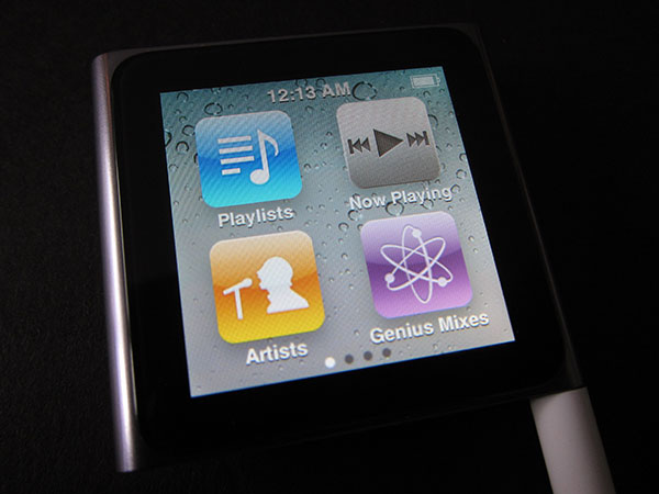
Giving each of these modest features its own icon may sound a little crazy, but Apple obviously took this route for two reasons: first, the icons make the iPod nano look like it has a lot of features, which it doesn’t, and they’re better than the alternative—largely white scrolling screens with black text, just like the prior iPod nanos. That’s actually what you’ll see after clicking on most of the icons, with extra white space to accommodate the imprecision that fingers introduce relative to wheel-and-button-based track selection. Only three or four title, artist, or album names appear at once on the screen, which makes for a lot of swiping through lists unless you use the miniaturized alphabetical navigation bar on the right of the screen, a godsend that actually works pretty well if your finger’s not shaking. A list-scrolling interface that’s dependent on a thin jump bar is just one of the ways in which the new interface feels practical and iOS-consistent from a design standpoint, but less than ideal as a user experience.

Another is the way that Apple has tried to work around the absence of a Home Button, which has proved more convenient and versatile over the years than most early iPhone or iPod touch adopters could have imagined. With no Home Button, the iPod nano requires you to either swipe from left to right over and over again until you return to the Home Screen, or hold down on some empty space on the otherwise packed display until the Home Screen reappears. Since the empty space changes locations from screen to screen, sometimes in the middle and sometimes near an edge, you’ll always need to hunt for a place to hold your finger. It’s this kind of bizarre inconvenience—like needing to hit the last iPod shuffle’s play/pause button three times to go back a track—that shows how Apple’s hate of buttons has recently gone too far; adding just that one button would have saved a lot of frustration.
The last major oddity in the new iPod nano’s interface is its support—or lack thereof—for multi-touch gestures. Apple has touted the nano as a “Multi-Touch” device, but in reality, its screen is too small for more than two adult fingers to do anything but sit there simultaneously, so there’s only one two-finger gesture on the device. No, it’s not “pinch to zoom,” which might have made sense for the Photos feature, but rather “turn to rotate,” which is used to spin the entire interface 90, 180, or 270 degrees so that the screen can be read in any position the nano’s in. As before, the iPod nano has an accelerometer than could have done this automatically, but Apple doesn’t use it for this purpose.

Would it have made more sense to use the accelerometer here, just as in the last iPod nano, plus all iPhones, iPads, and iPod touches? Maybe, maybe not. The accelerometer was most noteworthy in past nanos because of a self-explanatory feature called Shake to Shuffle, and still does that here; the awkward angles a clipped nano may take when hanging off clothes might lead the screen to rotate unnecessarily. But the idea of calling the new nano “Multi-Touch” when rotating the screen is its only multi-finger gesture seems like overaggressive marketing; the nano might be capable of more, but as is, the advanced display offers almost no benefit to end users.
One final note on changes to the iPod nano user interface regards Accessibility, the collection of features designed to make the device usable by hearing- or visually-disabled listeners. Apple has brought over a couple of features from the iPhone and iPod touch—Mono Audio and the screen color-flipping White on Black—while keeping the text-to-speech VoiceOver system, and removing others, including support for larger fonts. Between the smaller-than-iPod touch, unscalable text used on Home Screen icons and other elements of the interface, and the removal of physical track-switching and play/pause buttons, our feeling is that the sixth-generation nano is a comparatively weak choice for disabled users relative to its predecessor.


